FOCAL International brand refresh
This project has been assigned the following categories: Brand development,
-
Brand identity
-
Logotype
-
Brand guidelines
Client overview
FOCAL International is a specialist, professional, not-for-profit trade association and the pre-eminent voice and leading authority on audio visual archives.
Project overview
We were originally commissioned to develop a new website for FOCAL International, however, after highlighting to the client that the logo and current identity could be improved they agreed to a brand refresh.
Updated logo
The old FOCAL logo had a number of issues:
- loose font tracking that over accentuated the name resulting in an uncomfortable long form
- there were too many colours
- a mixture of font weights and sizes that became illegible when used at a small scale
Using the bold version of the existing typeface, we modernised the logo by condensing the words ‘FOCAL’ and ‘International’. In addition, we removed the tagline to create more space for the bigger wordmark.
Focal logo before and after
Expanding the brand
There were no recognisable brand elements within FOCAL International, aside from their ‘globe mark’. So, we added two elements to accompany their new logo and colours. The first was scribble/doodle forming a letter F, for FOCAL, emulating a hand gesture wiping a dust on a surface to reveal an image/graphic/video behind it — a window to the past. The second element is the starburst, an evolution of the ‘globe mark’ of the logo, where the globe explodes to reveal new footage. Instead of circular dots, we used an elongated ellipse to showcase the breadth of experience and genres that FOCAL covers.
Focal scribble
FOCAL International starburst animation
We even jazzed up the globe icon too…
Animated version of the FOCAL globe
Animation of the typefaces used by FOCAL International
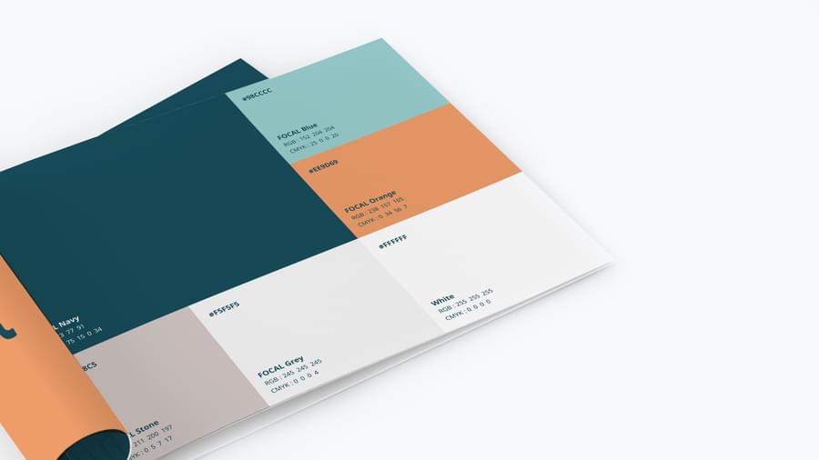
Simple brand guidelines
Not all brand guidelines end up being so in-depth that they could double as a door stop. We often create simple brand guidelines for our clients that cover the essentials providing advice on the preferred implementation of the identity. Even basic guidelines like this are better than none at all.
Related projects

Like what you see?
Book a meeting with our experts and let’s find out how we can help you.


