Control Energy Costs brand identity
This project has been assigned the following categories: Brand development,
-
Brand identity
-
Logotype
-
Brand guidelines
Client overview
Control Energy Costs provides businesses with tailor-made utility management and procurement solutions to ensure their customers secure the best possible price for their energy and water supplies.
Project overview
In 2019, Scaramanga was awarded the commission by Control Energy Costs to be their full-service agency. Our goal was simple: to help them meet their business growth targets by repositioning their brand and implementing the marketing plan we devised to support these aims.
Clearly attracted by our bold approach and love of facing challenges head on, we got to work immediately.
What’s in a name?
Our process began with a multi-day branding workshop to flesh out Control Energy Costs’ key brand characteristics and ascertain what does/will differentiate them in their sector.
This was closely followed by an intense period of collaboration to develop a full marketing strategy and define the deliverables. The first of these deliverables being a new identity to reflect the adjustment to the name. What changed?
They were previously know as CEC Direct. As this initialism could stand for anything it was clear that we needed to remove any potential confusion by spelling out their name in full as Control Energy Costs expressly describes their business.
Control Energy Costs animated logo
The logo (old and new)
Control Energy Costs’ previous logo was unconfident, messy and contained graphics of taps, flames and electricity symbols. In addition, the visual identity also used silhouetted figures which felt obfuscating and unapproachable – the complete opposite of how they wanted to be perceived. Overall, their visual language did not match the messaging required for today’s audience who are attracted to a more green, socially responsible agenda.
The new visual identity Scaramanga has created for Control Energy Costs is unashamedly confident; utilitarian enough for modern usage across multiple digital platforms and print; distinctive enough to differentiate them from their competitors; flexible enough to expand as their business expands into other markets. In short, it possesses all the hallmarks of a quality brand.
Of course, our efforts didn’t stop at designing the logo. We developed a complete brand identity and develop brand guidelines to ensure the continued integrity of the new brand.
CEC brand guidelines with animation
A breath of fresh air
We developed their narrative by focusing on the words ‘and breathe’ that is now embedded in their brand. We want everything about interacting with the Control Energy Costs to be as simple and calm as possible – whilst subtly promoting their green credentials. This concept is imbued within the copy and imagery is used to promote Control Energy Costs.
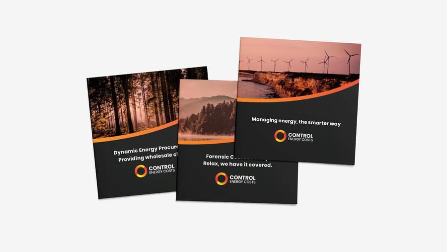
Custom imagery
Energy isn't something that we see, it's something we use. And for that reason, many of Control Energy Costs' competitors use 'businessmen in boardroom' style stock imagery. We wanted to avoid this completely as it is an approach that is dated and overused — meaning there is little brand recognition as these images could belong to anyone. Consumers attitudes are shifting especially in regards to energy consumption and being more environmentally responsible so this played a key part in our decision making about the imagery used to represent the business.
We developed a custom filter that could be applied to any image that instantly creates a recognisable image style. The tone was deliberately selected to create a sense of nostalgia as people often see the past more positively with rose tinted glasses. We wanted to imbue this same sense of fondness towards the brand.


Like what you see?
Book a meeting with our experts and let’s find out how we can help you.


