BAFTA upgrades jury voting service with Scaramanga
This project has been assigned the following categories: UX/UI,
-
Improved the UX and UI
-
Responsive
-
Accessible
Client overview
The British Academy of Film and Television Arts (BAFTA) is a world-leading independent arts charity that celebrates the very best in film, games and television. BAFTA is a returning client of Scaramanga, and they approached us with the task of improving the usability and user interface (UI) of their jury voting app.
Project overview
The British Academy of Film and Television Arts (BAFTA) has partnered with Scaramanga to redesign its jury voting service. The new design improves the user interface (UI) and user experience (UX) of the service, making it easier and more enjoyable for jurors to cast their votes.
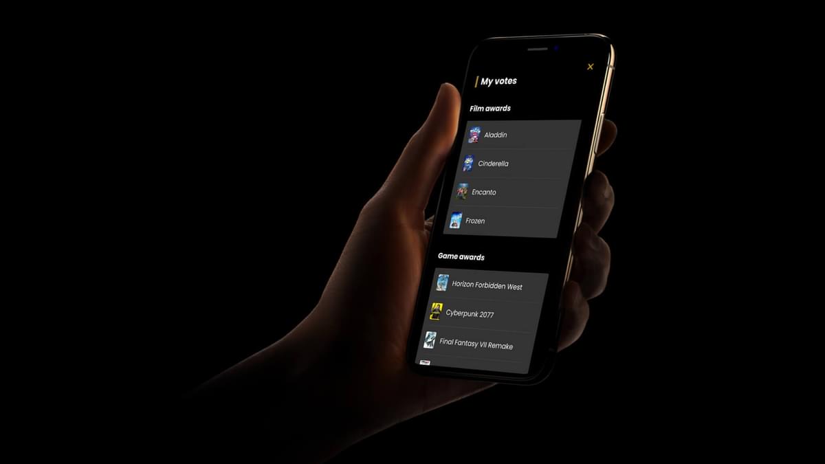
The previous jury voting service was designed specifically for a tablet, but the new design works on all devices, including laptops, tablets, and smartphones. This makes it easier for jurors to vote from anywhere, at any time.
The new design also features a more modern and user-friendly interface. The buttons and menus are larger and easier to click, and the text is easier to read. The overall design is more visually appealing and engaging.
In addition to improving the UI and UX, the new design also injects more of the BAFTA brand into the service. The colours and fonts have been updated to reflect the BAFTA brand identity. This helps to create a more cohesive and unified experience for jurors.
The new jury voting service offers a number of benefits over the previous design, including:
- Improved UI and UX: The new design is more user-friendly and easier to use on all devices.
- Modern and engaging design: The new design is more visually appealing and engaging.
- Increased brand awareness: The new design injects more of the BAFTA brand into the service, helping to create a more cohesive and unified experience for jurors.
Background
The original jury voting process involved gathering the jury in a room, with a single tablet that would be passed around so individuals could cast their vote. This process would be repeated until all votes were cast and voting was complete.
However, due to the COVID-19 pandemic, in-person meetings were no longer possible. It was essential that voting continued, so the in-house team created a version of the software that could be accessed remotely.
The original voting software was specifically designed for a tablet, and it did not work well on other devices. Our goal was to develop the UI/UX for the existing software so that it would work on all devices.
Wireframes
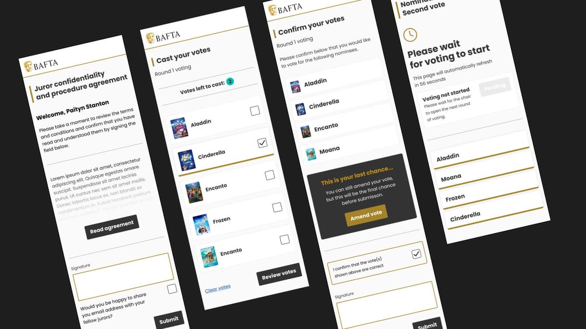
We began the design process by creating wireframes. Wireframes are low-fidelity representations of the user interface (UI) that help us to visualise the layout and structure of the app.
We started with mobile first, which means that we designed the app for mobile devices first. This is a good approach because mobile devices have a smaller screen size, so we need to be more intentional about the design.
Once we had a mobile wireframe that we were happy with, we then created wireframes for tablet and desktop devices. This was a relatively easy process because we had already established the overall layout and structure of the app.
We used a mobile-first approach because it helps us to focus on the most important details. When designing for a small screen, we need to be careful not to overwhelm the user with too much information. By starting with mobile first, we were able to focus on the essential elements of the UI and make sure that they were easy to find and use.
As we moved to larger screen sizes, we were able to add more flourishes and details to the UI. However, we always kept the mobile-first approach in mind and made sure that the UI was still easy to use on all devices.
Pain points
During the initial discovery phase, we asked BAFTA to identify any few pain points that required attention. Here are the two that were at the top of their list…
Issue 1
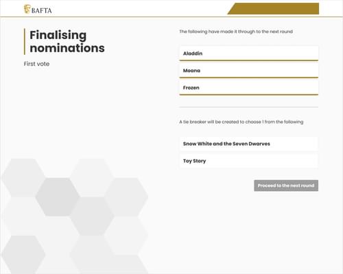
The Chair could prematurely progress the voting to the next stage, before the jury had finished voting. This could lead to inaccurate results and a frustrating experience for jurors.
The solution
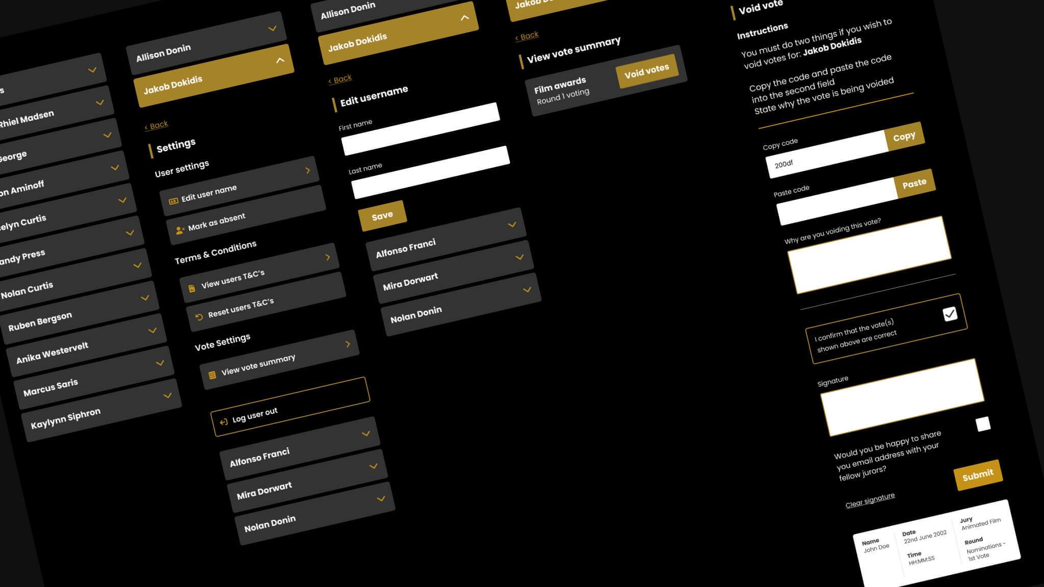
We added clear states to the buttons in the voting service. The "Next" button would be grayed out until all jurors had submitted their votes. This would prevent the Chair from prematurely progressing the voting and ensure that all votes were counted.
Issue 2
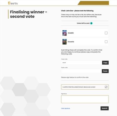
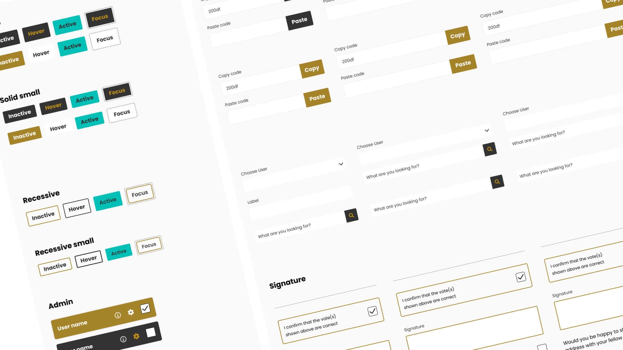
Administrators and Supervisors were having difficulty copying and pasting randomly generated codes to confirm signatures. The text had to be manually highlighted from within a sentence, copied, and then pasted into a text field. This was a time-consuming and frustrating process, especially on mobile and tablet devices.
We proposed and implemented a solution that involved two defined separate fields. The first field would contain the randomly generated code, and the second field would have a clearly labeled "Copy" button. Users could then click the "Copy" button to copy the code, and then click the "Paste" button in the second field to paste the code. This solution made the process of copying and pasting codes much faster and easier, especially on mobile and tablet devices.
Design insights
We began the redesign process by choosing colours from the BAFTA palette that were accessible and met accessibility standards for colour contrast.
We then worked these colours into the design, being mindful of the overall look and feel of the service. We wanted to create a design that was both visually appealing and easy to use.
As the service had already been developed and was in place, there was little scope to add new functionality. Because of this, we had to be creative in the way that we reworked the system to give a better user experience.
We achieved this through the use of color to highlight buttons or key areas (acting as signposts for interaction) and to make components that weren’t providing primary functionality more recessive, but not hidden. We aimed to keep as much as possible exposed so that users would not have to think too hard.
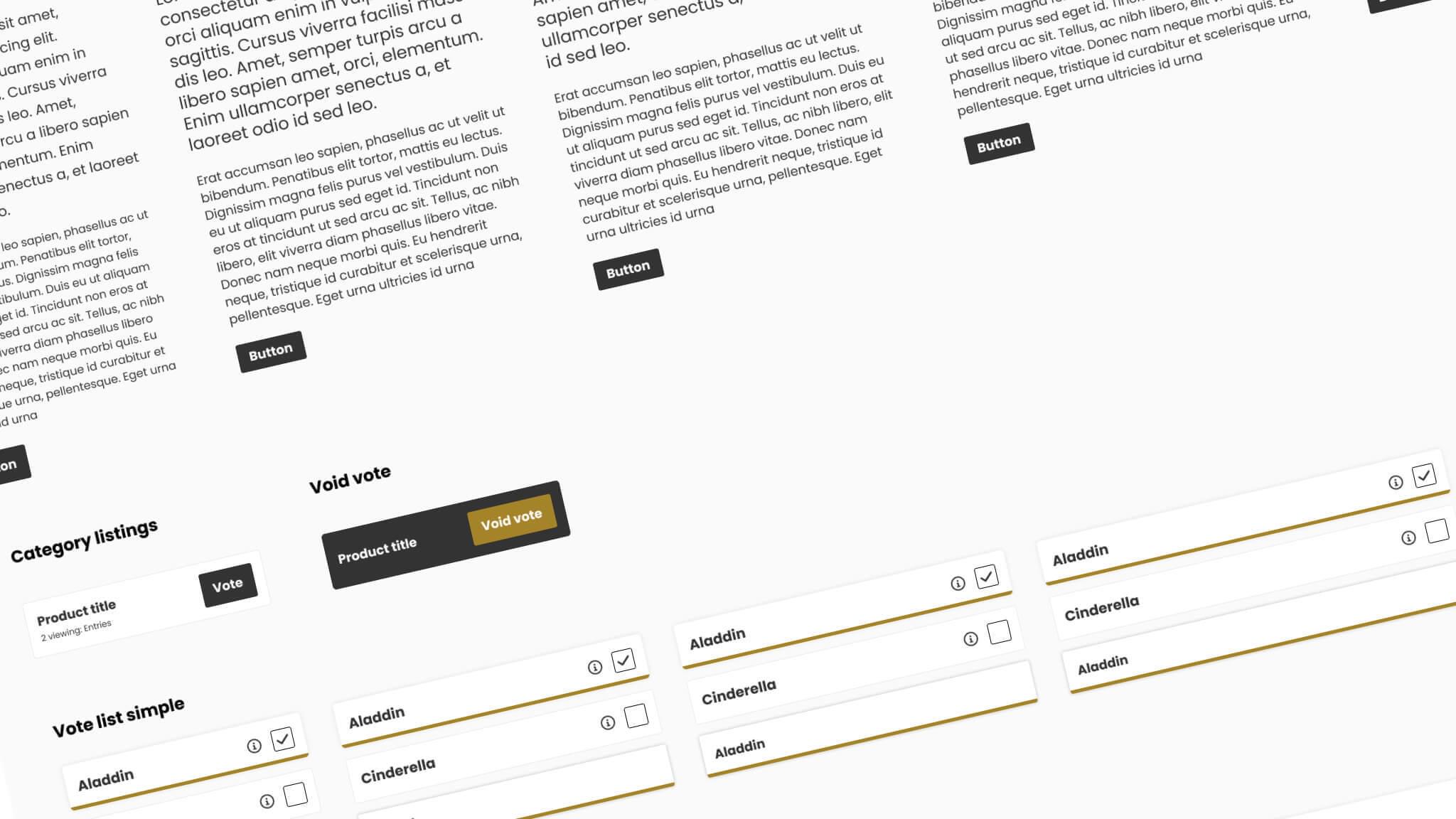
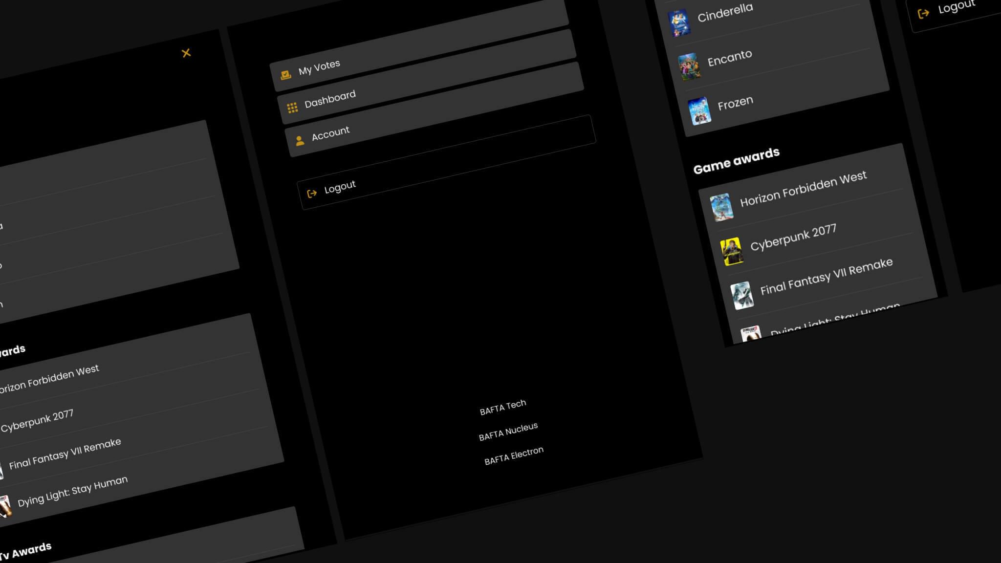
Voting choices
We made the voting choices more prominent by making them large buttons. We also added a gold bar to the bottom of the selected vote, using the color from the BAFTA palette. This helped to inform the user of their selection.
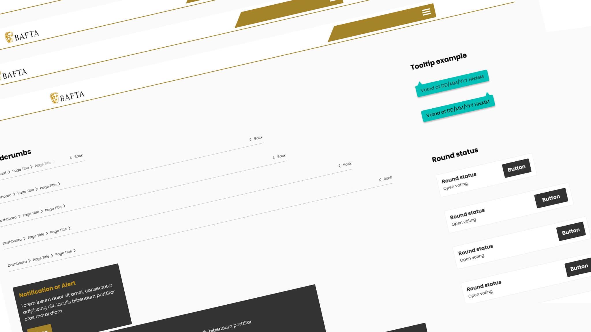
Important elements
Some important elements of the voting process were less visually represented near the header, where the eye would not have naturally gone to. We moved these elements down into the content, where they would follow the natural flow as the user reads the page. We also highlighted these key areas as needed.
Action required
We devised a solution for where an action would be required by adding a gold border around elements of forms, for example. This served to highlight that the user had to interact with the elements before they could progress.
UI Kit
To ensure that the BAFTA in-house team could implement the design correctly, we provided them with a set of instructions and a UI Kit as a reference. The UI Kit provides examples of all the components used in the design, such as buttons, text fields, and icons. This helped the team to understand the design and to implement it accurately.
The UI Kit also includes instructions on how to use the components, such as how to change the color, size, and font of the text. This gave the team the flexibility to customize the design to meet their specific needs.
The UI Kit was a valuable resource for the BAFTA in-house team. It helped them to implement the design quickly and accurately, and it gave them the flexibility to customise the design to meet their specific needs.
Click on an image below to view a larger image.
Other projects for BAFTA
BAFTA - Events booking
Like what you see?
Book a meeting with our experts and let’s find out how we can help you.


