Colour accessibility
Written by Ellis Wigley
The web is a vast space and not everybody has the same experience due, but not limited, to visual impairments.
This article has been assigned the following categories: Accessibility,
As designers, developers and companies it’s our ethical (and often legal) responsibility to be certain that our digital and printed collateral is accessible to as many users as possible.
I am Scaramanga’s Digital Designer and spend a lot of my time selecting typefaces and colours when developing designs for our digital projects.
I hope that this article will serve as a stepping stone to raise awareness of the importance of colour accessibility and it will provide insights to both clients, designers and developers.
What is colour accessibility and why is it important?
According to the World Health Organisation (WHO), an estimated 2.2 billion people globally have some form of visual impairment.
As designers, it’s down to us to ensure that those with visual impairments or deficiencies can access content with the same ease as their non visually impaired counterparts. This means we need to consider whether sufficient contrast has been given between content, background and non-decorative imagery.
Colour and contrast are vital to ensuring that websites are accessible for all users regardless of visual impairments.
It is not fair to neglect a large portion of your users when a few simple changes for ethical best practises can be made.
How is coloured defined?
When designing, we have a number of ways to define a colour.
- RGB
- Hexadecimal
- HSL
RGB is the Red, Green and Blue that form a colour.
Hexadecimal is the one with a # before and a mix of 6 numbers and or letters, for example, black would be #000000
HSL is Hue, Saturation and Lightness and is the truest way that people view colours. If we changed the lightness of a colour, it would change the contrast of it too. How light or how dark an element should be depends on the background colour behind the element.
What is the criteria for accessible colours?
A study completed by the Society for innovation, technology and modernisation (Soctim) found that 4 in 10 local council websites failed basic accessibility testing.
This study found issues that included lack of keyboard navigation, inaccessible PDF forms (that were unable to be read out by screen readers) and most importantly, in relation to this article, colour contrast was incredibly poor. This resulted in the exclusion of a large group of website users who rely on accessing the content on a website to get important information.
This led to new laws being introduced (based on the Web Content Accessibility Guidelines 2.1) which now require public sector websites to conform to accessibility standards, however, understanding what needs to be changed can be difficult.
Thankfully, there are tools that can help identify issues on your own website. For example, a good site for testing how your design would look to someone with colour blindness can be found at Toptal. They have created a tool that allows you to type in a URL and view how the site will look with different variations of colour blindness. It can be found at the following link: https://www.toptal.com/designers/colorfilter/
Definitions and conformity
The World Wide Web Consortium (W3C) is the international community that develops open standards to ensure the long-term growth of the Web. They developed Web Content Accessibility Guidelines (2.1) with 3 levels of conformity:
- Level A: The minimum level.
- Level AA: This level satisfies the most common accessibility standard. Website developers should be focused to reach this level.
- Level AAA: This is the highest tier and is the most difficult to attain. It is not compulsory to reach this level, but it acts as the gold standard.
Colour contrast forms part of AA conformance and this is what we at Scaramanga aim for with our builds.
Making colours accessible for everyone can be a daunting task, but colour compliance can be an easy win. It’s something you could and should start doing from the start. Unfortunately, many modern UX/UI design practises (such as using grey for inactive states on buttons) do not satisfy accessible standards because of low contrast issues.
There are, however, plenty of tools available on the internet that can help you achieve your goals.
First and foremost, you can head over to WebAIM Colour Contrast Checker. Here you can enter your foreground colour and then enter the background colour. In my example, I’ve chosen white #FFFFFF as my foreground colour and a pastel blue as my background colour #5797FF
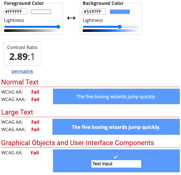
By all accounts, there doesn’t appear to be anything wrong with the colour choices for a non-visually impaired person. However, to the left of the chosen colours, you’ll notice that this colour combination fails on all levels. This is due to the fact that they’re not meeting the minimum standard ratio of 4.5:1 for normal sized text or 3:1 for large text (large text is defined as typically anything above 18px).
To rectify this issue and ensure that these colours would work for all users you can adjust the lightness of either the text colour to a darker colour, or adjust the background to a darker colour.
Changing the text colour to black works, but it doesn’t look as aesthetically pleasing…
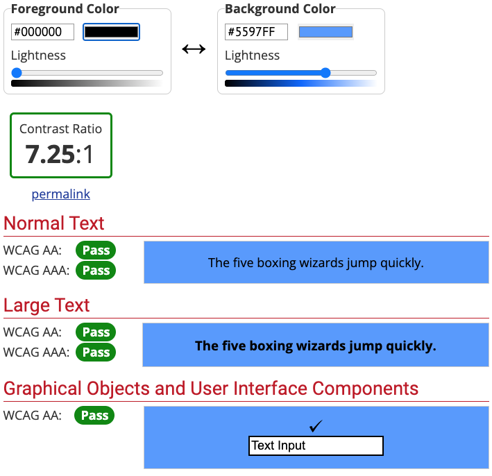
It does meet the WCAG AAA too, but this standard is the holy grail and can be extremely difficult to attain and maintain. Although this technically passes the contrast check, I wouldn’t use this in a design as it is, in my opinion, more difficult to read.
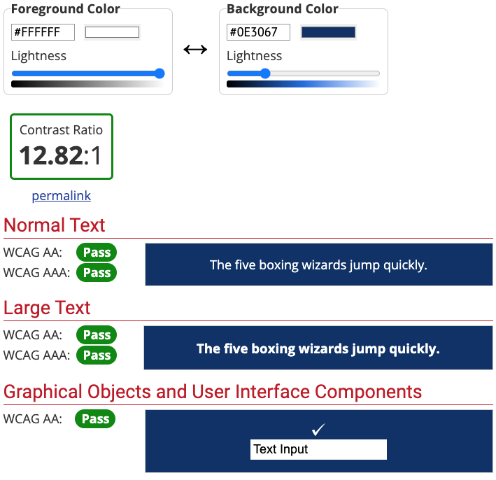
Darkening the background in this scenario would be the preferred option as it's nicer to look at and works across the board, but this type of change may not be permissible as the colour change is too extreme. As you can see, this isn’t always an easy thing to get right.
Exceptions to the rule
There are exceptions to the rule of the 4.5:1 colour contrast ratio
- Images that are text which serve no other purpose than decoration are not subject to accessible colour contrast rules
- Large text (18px +) needs to conform to at least a 3:1 ratio
- Oddly, brand logos do not have to meet accessible colour standards. However, if you have the scope to do so then there’s no reason why you could not or should not reflect accessible colour standards here too, as well as the design
Brand colour palettes
On the subject of brand palettes, what do you do if your brand colour palette does not pass the contrast checks? One option is to create a complementary accessible colour palette to sit alongside your existing one. Depending on your colour choices, this may not be a huge issue — requiring only minor adjustments. However, be warned. You’re not going to be passing any accessibility checks anytime soon if lime green is your primary colour. White text on lime green is never going to work. Something will need to change.
What was originally your favourite lime green, is now suddenly a yellow-green shade and your text has changed from white to black. A long way from your brand colours. At this point, a designer is your best option.
This is why it is always preferable to consider colour accessibility from the start of a project.
Algorithms are not the gospel truth!
There is some chatter about the algorithms used to determine colour contrast in Web Content Accessibility Guidelines (Version 2.1) being “out of whack and that they need changing” as they are causing some colours to fail that should pass a contrast test — debunking the myth that the WCAG requirements are always the best option.
WCAG 3 will use a new colour contrast method called APCA (Advanced Perceptual Contrast Algorithm), which resolves the issues outlined in the article.
Typically, contrast ratios can fail with white text when it is placed on a light background due to low contrast ratios. My goal is to always consider what my users see and not totally rely on the algorithm.
An example is shown below:
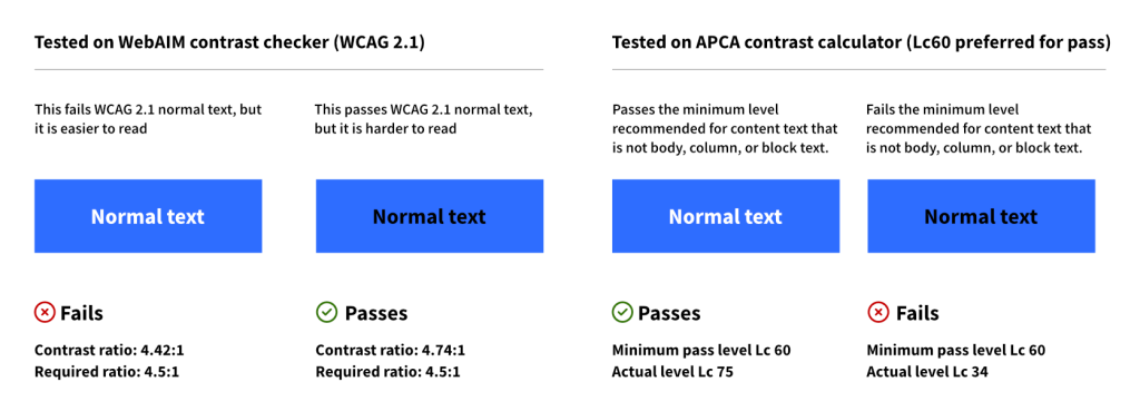
Although the white text on the blue background fails the WCAG 2.1 contrast criteria, it is still legible and it does pass the checks with the newer APCA test.
Tools for designers
Depending on what software you use to design there are apps available inside the software that can help you to navigate what colour combinations pass the AA and AAA standards. The ones I personally use in Figma are listed below:
- A11y - Colour Contrast Checker
- Contrast (I use this one the most)
- Stark - Stark also allows you to generate the design based upon the different variations of colour blindness, but it does require a paid upgrade to view all
- Even if you don’t use Figma, there are plenty of resources available online:
- Colour Contrast - this one is helpful as you can see at the same time whether your colours pass accessibility benchmarks and even choose a typeface from a selection of common Google Fonts. Much like Colorable you can change the colours dynamically
- Colorable is good as it allows you to see in real time how the colours would look and lets you change the colours dynamically
- APCA Contrast Calculator Advanced Perceptual Contrast Algorithm, new colour contrast method that WCAG 3.0 will use.
What can we learn from this article?
The power of colour is an immensely strong tool and it can emit emotional responses from users. It can allow endless design possibilities, but only if we design to be inclusive. Designers, developers and companies need to get into the mindset that not everyone's the same and that some of their demographic, no matter how small or large, won’t be able to read what’s in front of them clearly. We need to design for more than one type of colour vision and start making more informed choices about using the right colours in the right situations.
In conclusion, designing with accessible colours from the offset, rather than retrospectively changing colours to be accessible, is highly recommended.
If you’re looking to make your site accessible, get in touch with Scaramanga today to see what we can do for you.


