Accessible design and UX
Written by Ellis Wigley
“Good design is actually a lot harder to notice than poor design, in part because good designs fit our needs so well that the design is invisible.”
- Don Norman, founder of Neilsen/Norman Group and the father of UX.
This article has been assigned the following categories: Accessibility, Tips, UX/UI,
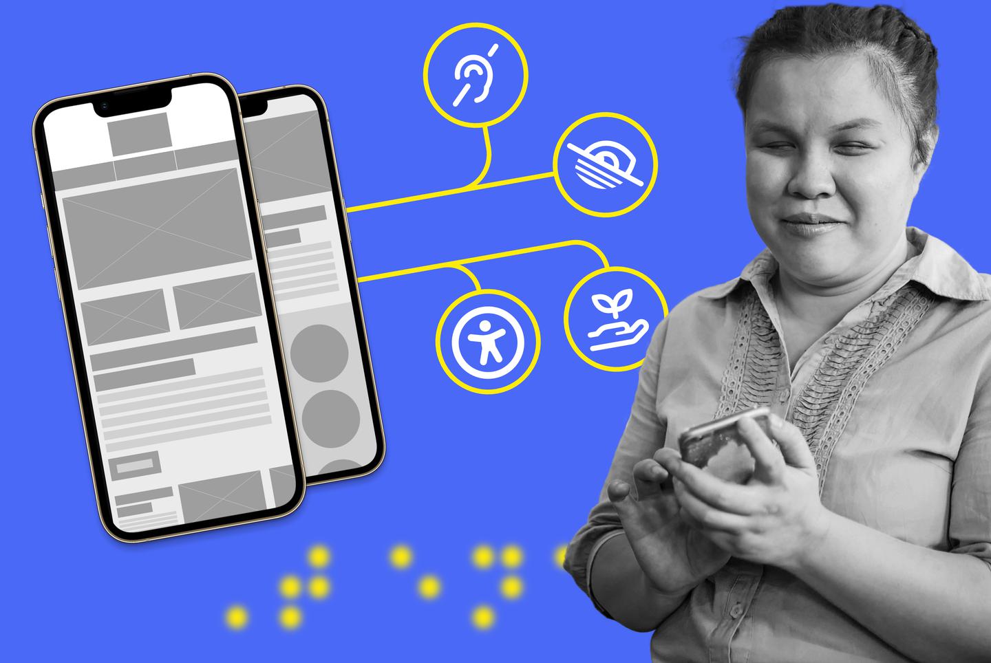
Let me start by explaining a little about what I do here at Scaramanga. My job is to create graphics and visually appealing websites and make sure that everything I design is accessible to everyone while providing an experience that doesn’t make the user have to think too hard.
Before we delve into the article, let’s quickly explain a few terms.
- Visual appearance: This covers the visual appearance and how someone with a visual impairment is going to view the content on the page and what they can see. I wrote about Colour accessibility for more in depth insights on this subject
- Limited motor functions: Helping someone who may not have full motor functions and thinking about the placement of elements and how it would affect their experience of using a website I have created
- Cognitive: Helping simplify journeys and avoid cognitive overload so that users can reach their destination without having to think
What exactly is UX?
User experience, or UX as it’s more commonly known, is the skill of tailoring the design of a digital product so the overall experience for someone using a website, application, interface or product is simple and pleasing to use.
The term User Experience was coined by Don Norman, who many see as the father of UX, a psychologist and usability consultant who has worked with the likes of Apple, HP and is one of the founders of the Nielsen Norman Group, world leaders in research-based user experience.
As I write this article, the closest thing to me at this moment is a torch my daughter is playing with.
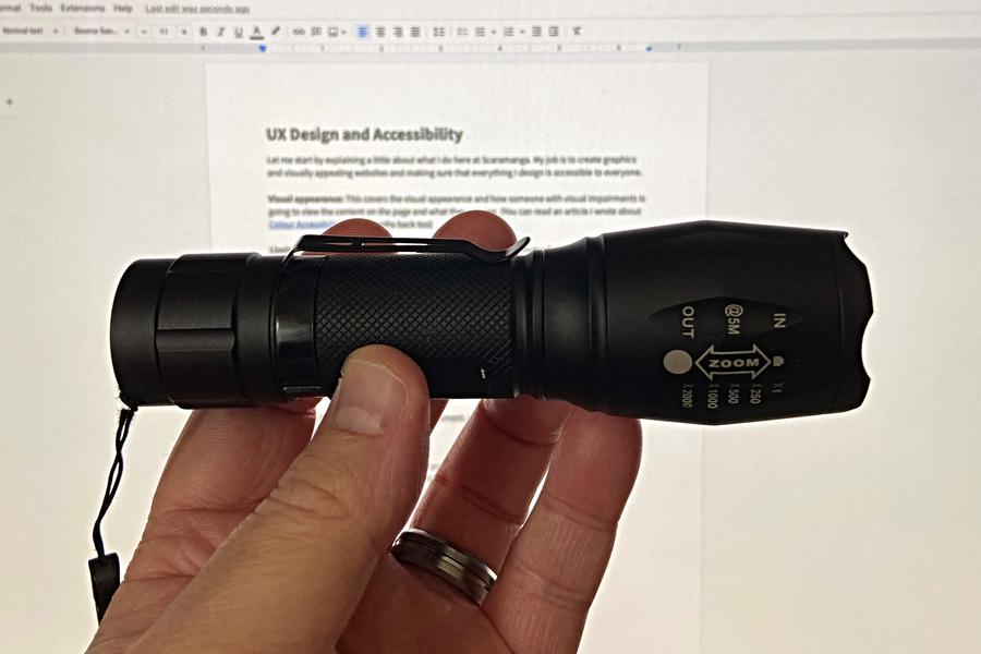
Besides looking like something out of a Rambo movie, it is simple to use. So simple, my youngest daughter, a little over 2 years old, worked out how to turn it on and off in mere seconds.
It has a loop, so I can put my hand through it when I’m stalking around a dark campsite on holiday.
The torch fits in the palm of my hand and is small enough for a child to easily hold.
I can fit the torch in my pocket, but I’ve got the option to clip it to my bag, clothes or anything else that might take it — giving easy access depending on where I put it. The important part of that sentence being where *I* put it, because it works for me. I might find it easier to keep it in my pocket, someone else working in the field might find it easier clipping it to their bag or belt. The point is that it’s become accessible for more than one type of person in their usage.
At the top of the cover where the light shines, it’s got some information that tells me I can change the zoom of the torch to have a wider or more focused beam by simply pulling the cover forward or backwards. Simple, clear instructions and a smooth easy to apply action.
Pressing the button to turn the torch on is a simple push click, which for those with limited hand motor functionality (or for my 2 year old daughter's fingers) makes for a better experience because they don’t have to do anything complicated for the torch to function.
For an able bodied person, gripping the torch like a pen naturally places your thumb near the button so it’s a simple movement to turn the torch on. There’s also an audible click for when the light is switched on and off, so those with reduced sight, rather than complete loss of sight, will know undoubtedly that the light is on or off.
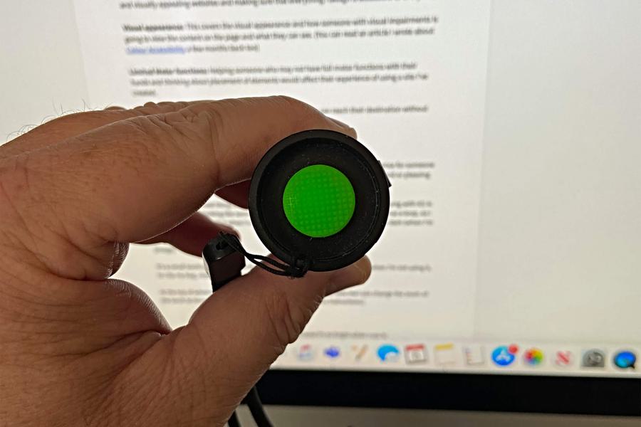
The importance of colour
With the torch being black, any colours that are used on it are going to stand out more to someone without any visual impairments. If you look at the image in the previous section, you may find it difficult to see the ‘on’ button. This button is placed at the other end of the torch, but it’s not hidden. It’s a bright green exposed button, recessed into the torch so it still produces clean lines in the design. For users with impaired vision, the button has a tactile texture so it isn’t reliant on colour alone to identify the button.
Psychologically I see the green of the button as a peaceful and safe colour with its ability to blend in, yet distinctive enough to know that if I press it, nothing bad should happen because of my association of green with safety (you can read a little bit more of the psychology behind colours on Color Psychology). If that button were orange or red, I might be more hesitant upon first pressing it, in case I did something wrong or set something off.
But what if you’re colour blind?
Let’s take the things we have learned from this simple torch and apply them to websites where the key is to provide an experience that’s simple, clean and accessible.
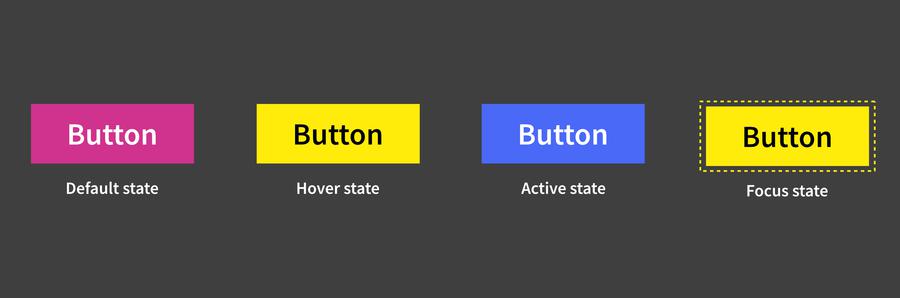
What happens if you have a visual impairment, like colour blindness? How would you know if a button you’re hovering over on the desktop is going to have an action on it, if nothing happens when you interact with it? This means that it’s imperative that buttons have different states, so that the user knows that an action is taking place or to serve as a visual indicator.
To accomplish this, we would include the following:
- Hover state: adding a hover state, changing the colour or adding in an underline (or even removing it) provides feedback to the user that their mouse pointer is over that button, or interactive element
- Active state: when you’re on a page, the respective link should be highlighted with a persistent state that a user can differentiate from existing elements so that it’s clear to the user where they are
- Focus state: when using your keyboard to tab through the elements on a page, any button or link should indicate that they have a focus applied to it, highlighting that it’s an interactive element. This is an essential tool of wayfinding for a user that is relying on a keyboard to navigate a website
What is an interactive element? Well it can be a number of things. Common interactive elements include a form field, button, hyperlink and a video. However there are many other examples such as image carousel, interactive chart and even an image can be made interactive if it is contained within a hyperlink.
What else can we do?
Naturally, making a website accessible isn’t limited to just colours or hover states. There’s a lot more that we can add to cast a wider net over a website to make it accessible to as many people as possible.
Media
Hearing impaired? With videos and podcasts, we should add a transcript to it. This is a WCAG 2.1 AA requirement.
Form fields
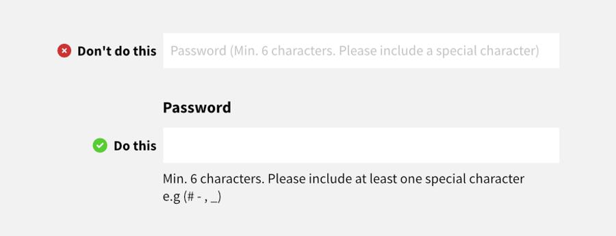
When creating forms, don’t use placeholder text in the fields. If your design is using placeholder text, once you start typing in that particular field, the hint or instructional text disappears meaning that if your user becomes distracted, which is likely, they’ll forget what they had to do in the first place. To get the instructions again, the user would have to click off the field or delete their input to view the instructions again.
Simply put, disappearing text is not good for users with short-term memory problems.
A prime example of this is when creating a password.
If your instructions are ‘Minimum 6 characters. Please include a special character (# - , _)’ and your users don't read this because there is typically not enough contrast between the text and background (I’ll admit to using placeholder text in my younger days. Oops!) and they’ve entered their password as ‘dog’, they’re going to see an error which is difficult to resolve if they’re unable to quickly read the instructions. This will frustrate the user and likely cause them to leave or not sign up.
The accessible way to build forms is to have labels for fields and, if required, clear exposed instructions removing the issue of forgetting the instructions for the field.
Adding alt text descriptions to images
For visually impaired users, they have to rely on screen readers to experience a website. By not adding descriptions to your images, they are unfairly missing out on context and content. If you don’t give your image a description, the screen reader will just read out the filename.
Picture this; you’re being fed a wonderful story on a blog about someone saving kittens from a burning building when suddenly, there’s an image in the content of the cute kittens being held and fed… but no description has been added to the image and I’m being bombarded with ‘IMG00587_v3_final_reallyfinal.jpg.’
Not only is it a bit jarring, but it is also giving no context whatsoever to the visually impaired user. A simple solution is to add a description to the image ‘A rescuer is holding a kitten, while feeding it a milk bottle.’ The easiest way to come up with a description is to close your eyes after looking at the image and describe it as if you’re telling someone else that hasn’t seen the image. Easy win.
Text clarity
Don’t make your body copy too small. As a rule of thumb, I try to have a minimum size of 18px when I design anything for tablet upwards and I go down to 16px for mobile.
Make sure that your sentences do not exceed 75 characters. This should mean your text width is 768px at most. Any wider and it can harm readability and frustrate users if they keep losing their place because a line is too long. The negative impact here is that if your text lines are too long, users will get bored, not read the content and then fail to understand the content because they’ve not read it properly.
Because we spend so much time on digital devices in this modern age, why not make it as pain free as possible to read content?
Links
If I’ve got a link inside a large body of copy, I always distinguish it from the general body copy. For example, the link will have an underline and be a different colour.
Try to give the link context, so if it’s on its own, it’s not ambiguous as to what it is. Try to avoid using ‘Click here’ or ‘More info’. For example, read my colour accessibility article (*cough*plug*cough*.)
The link is defined from the content and descriptive of where it will take you once clicked upon.
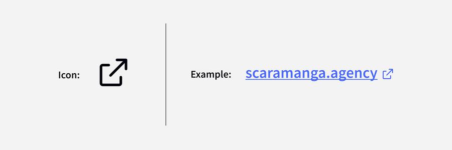
If your link is going to direct you to an external website, then accessibility implications need to be taken into consideration. According to the World Wide Web Consortium (W3C) opening a link in a new window can be disorienting for people, especially for those who may have difficulty understanding content.
There are however some instances where it’s acceptable to open a new window. These instances should be limited to:
- If the content provides help or assistance to the user
- If the user has logged into a secure area of a site and then follows a link outside of the secure area, it would cause them to be logged out
It’s recommended that if clicking a link will open a new window, the user should be warned. A pre-emptive action could also be adding a visual indicator to accompany the text similar to the image below.
Mobile
On mobile, for any touchpoints keep them at a minimum size of 40 x 40px.
Think about the placement of interactive content, like buttons. Think how a user with limited hand motor function would have to navigate the site. Consider that they may have to keep sliding the phone down to reach a navigation item or menu. Or they have to struggle holding their phone in two hands so they can use their other hand to navigate. Think about someone that doesn’t have 2 hands to hold a phone and how they would navigate on a mobile.
Don’t limit yourself to just people with impairments though, think of those that are fortunate enough to not have any issues, but they may be a busy person that only gets the chance to view a website on the move. They’ll want to get to the information quickly and not have to think too hard about it.
In conclusion
The great thing about working in this industry as a designer is that I’m given the opportunity to, in some small way, make the web a more welcoming and accessible place to be. The sense of satisfaction in solving a user's pain point is a continuing driving force to keep me going and facing the constantly evolving challenge of accessibility and providing an outstanding user experience.
This article touches on some of the many points I consider when designing. If you think your new website or project would benefit from a more caring inclusive approach to design then get in touch and share some details about your project.


