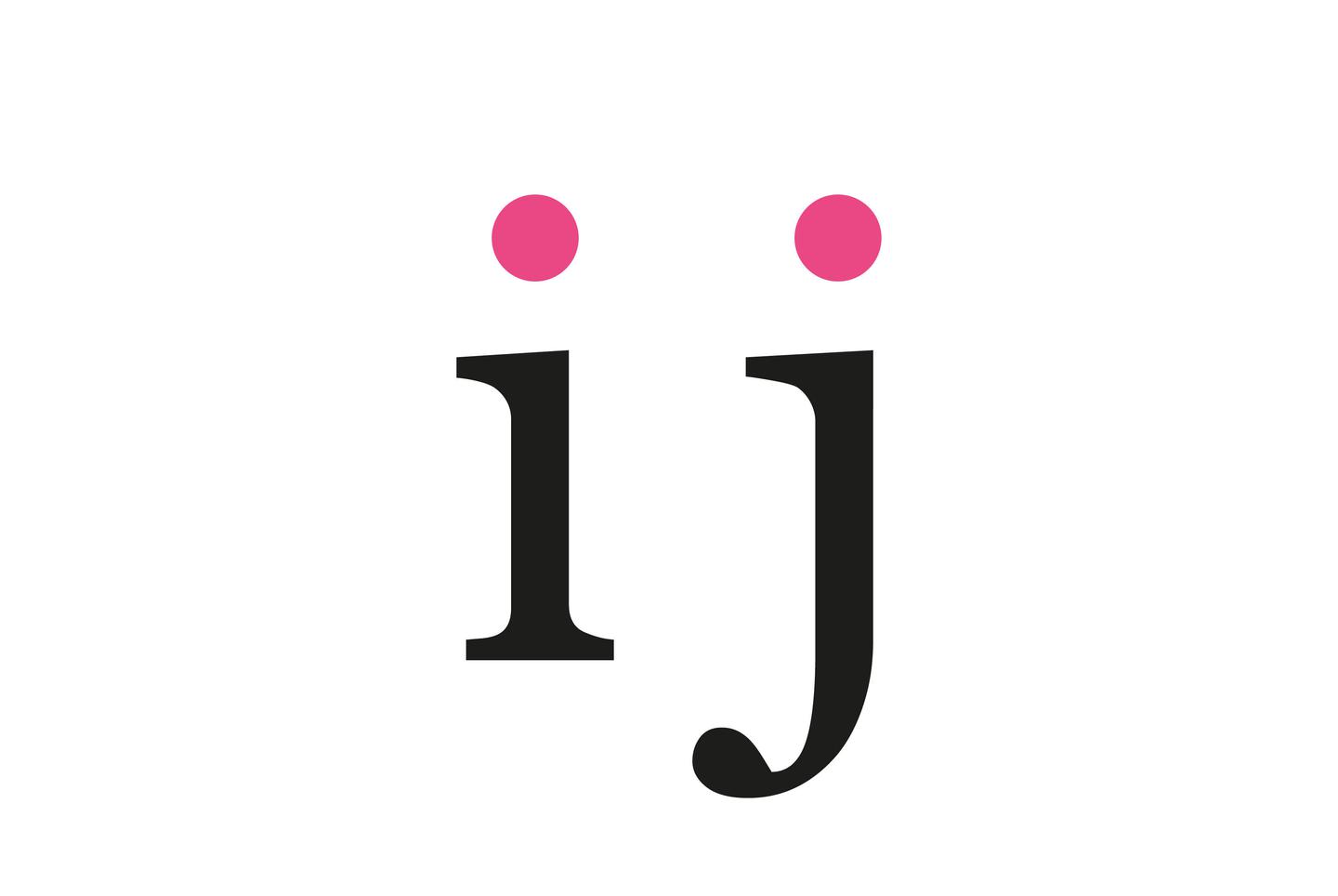
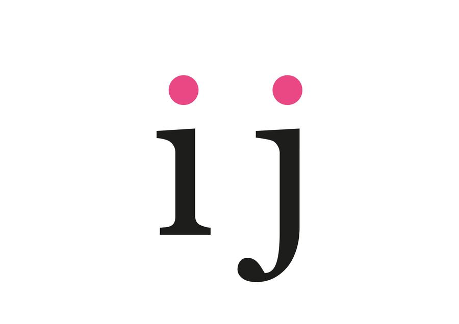
What is the dot over an I and j for?
Written by Simon Leadbetter
In this article we take a look at some less known typographic terms.
This article has been assigned the following categories: Tips,
Let’s start with the word tittle-tattle, which is a fairly well known English phrase that means to hold a casual conversation about other people, typically involving details that are not confirmed as true. In other words: idle gossip. Tattle means to to let out secrets to someone in authority, often to cause trouble. So, we can infer that tittle-tattle is to talk about other people’s secrets behind their backs. Now we are not going to do that but we will reveal some secrets about typography.
So why is there a dot above the lowercase i and j?
This diacritical mark is also called a tittle and it exists to help the reader easily distinguish them from other letterforms. In this instance, the word tittle finds its etymology from Hebrew and refers to the tiny overhang in a pen stroke that distinguishes one letter from another very similar letter.
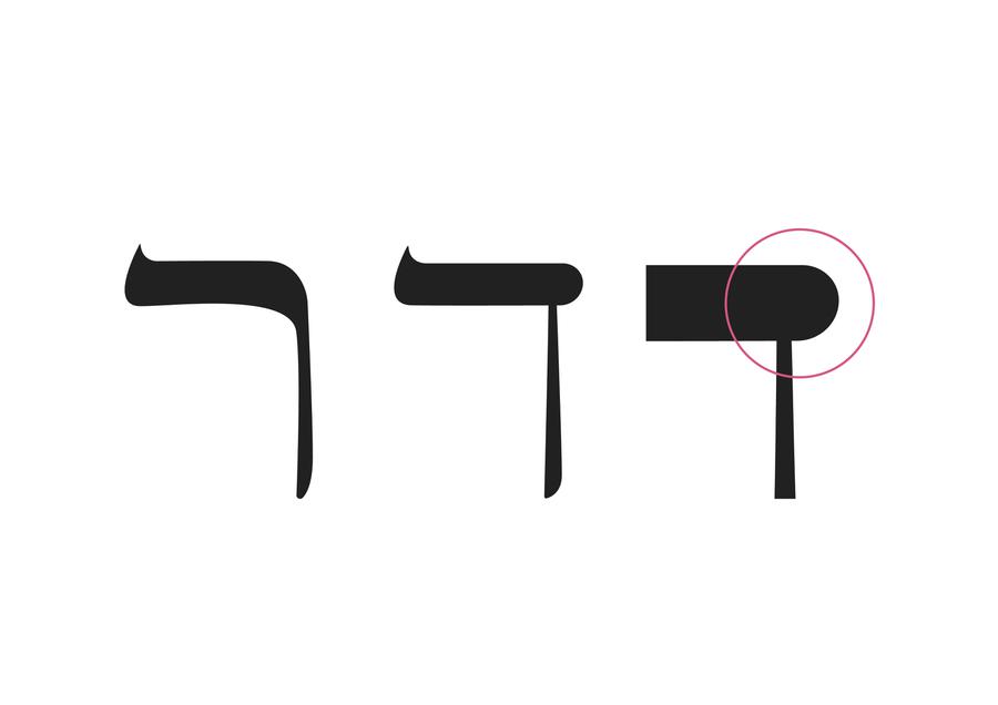
Compare the Hebrew resh character below (on the left) which is made with one smooth stroke. The daleth character (in the middle) is made with two strokes of the pen. Note the distinguishing overhang on the daleth (on the right) at the roof of the letter. There’s our tittle.
The dog ear
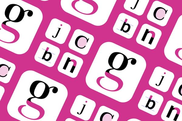
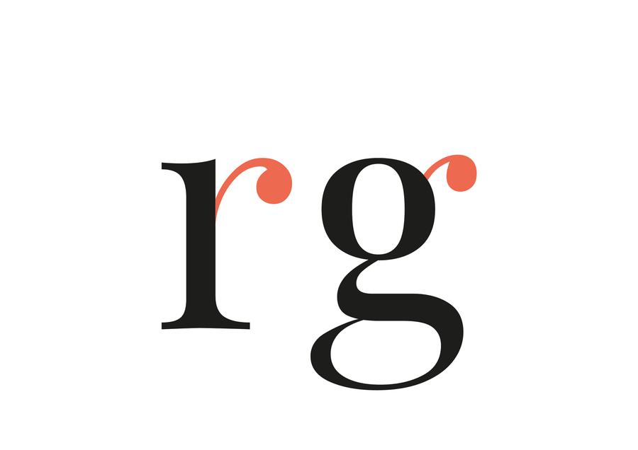
Another nice typographic term is ear or dog ear. This refers to the small stroke that extends from the upper-right side of the bowl on a lowercase g and, sometimes, the lowercase r. The appearance of the dog ear depends on the typeface, but its addition creates a friendly open character as well as providing better recognition when scanning text.
Upper and lowercase
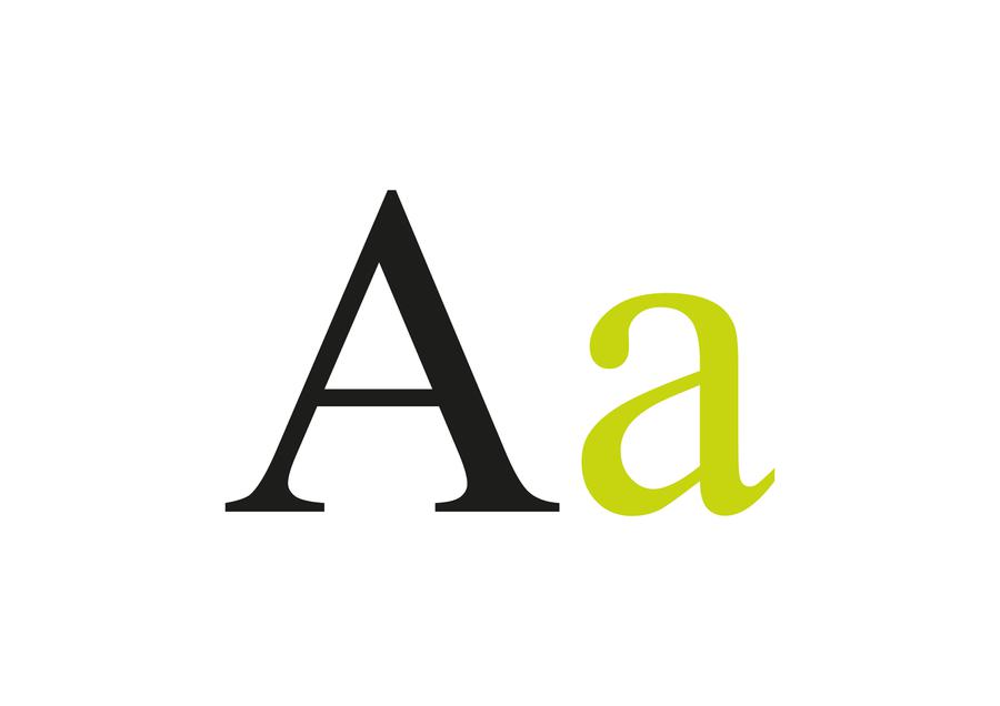
Now we keep referring to the term lowercase. This derives from the time when print was created using a hot metal press. Each character was kept in boxes called cases, with the majuscule (capital letters) in the upper case and the smaller minuscule letter in the lower case – hence lowercase and uppercase.
There are many other typographic terms like aperture, counter, eye and terminal which you can learn more about by visiting our typographic glossary.
A parting gift
We hope that scratched your typographical itch. We will leave you with another of our favourite typographic term, the Crotch: an acute, inside angle where two strokes meet.
Hopefully you won’t look so horrified the next time you hear your designer stating that they’ve been looking at crotches all day long.